NEURAL CONNECTIONS
- Role
- UI/UX Designer
- Year
- 2024
- Industry
- Child Healthcare
- Platform
- Web
- Status
- Live
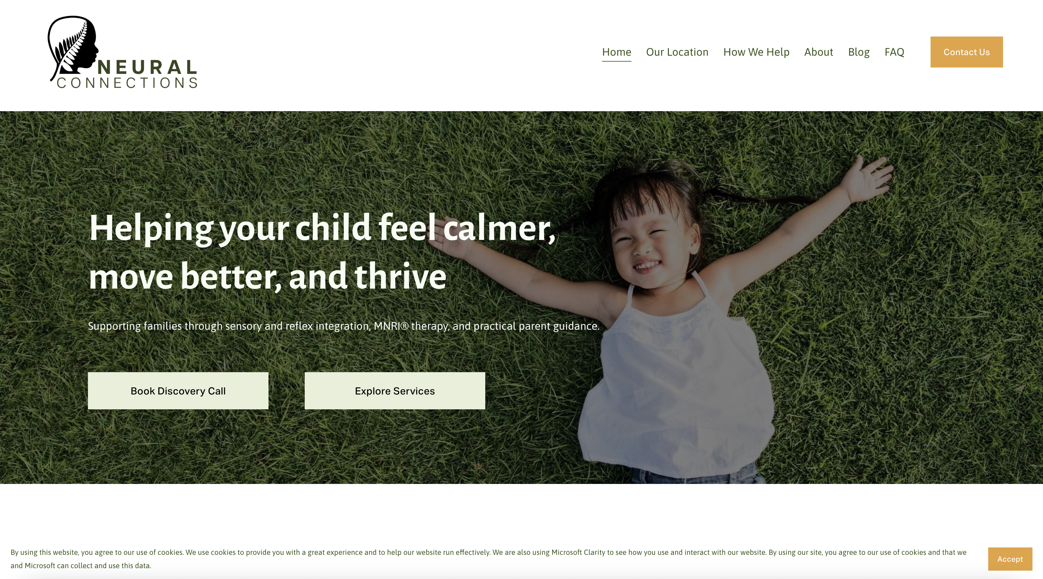
A Calmer Path Forward
Neural Connections is a Singapore child-therapy center specializing in MNRI (Masgutova Neurosensorimotor Reflex Integration) and sensory-integration therapy, supporting children through neurodevelopmental challenges. Its promise to parents is simple: help your child feel calmer, move better, and thrive.
The site is the first place an anxious parent lands, so it had to explain a specialized, unfamiliar therapy in plain, reassuring language and make the first step feel approachable.
Reassurance Over Jargon
Parents arriving here are often worried, wading through clinical terminology they have never encountered. A dense, jargon-heavy site would only add to the stress.
The work was to translate a niche clinical practice into warmth and clarity: what the therapy is, who it helps, and how to begin, without diluting its credibility.
Clarity, Gently
Every decision leaned toward calm and clarity, turning a parent's uncertainty into a clear next step.
Specialized terms that leave parents more anxious.
Warm, human explanations of the therapy and who it helps.
Hard to tell what is offered or where to start.
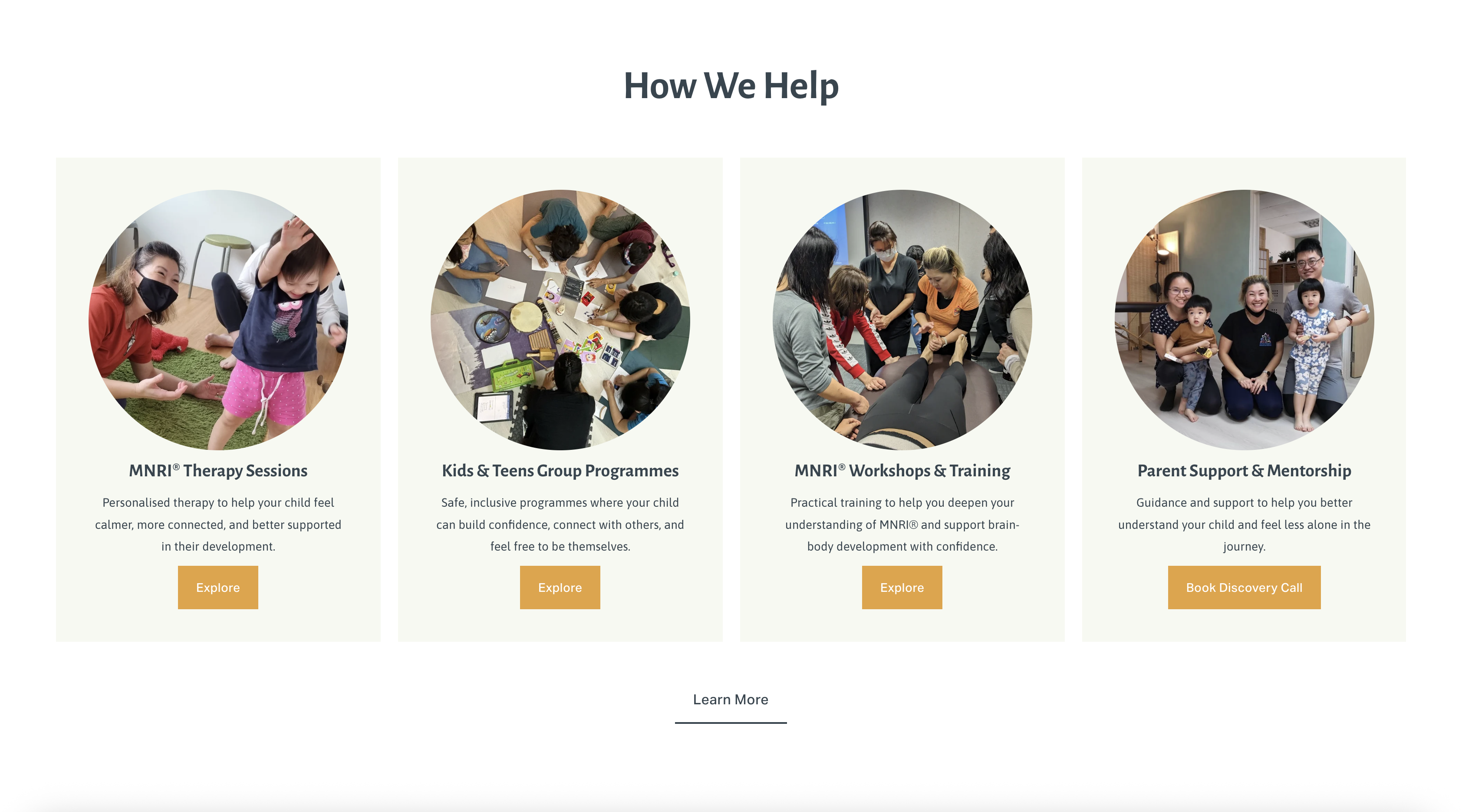
Services and a simple first step surfaced up front.
A sterile tone that adds distance.
A soft, reassuring identity that builds trust.
From Worry to First Visit
The site guides a parent from worry to a booked first session.
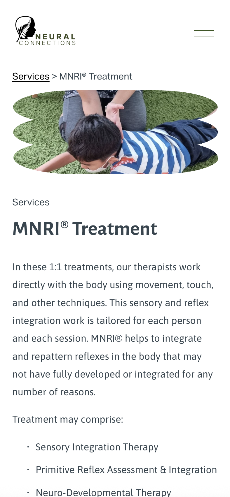
- Therapies
- MNRI and sensory-integration, explained simply.
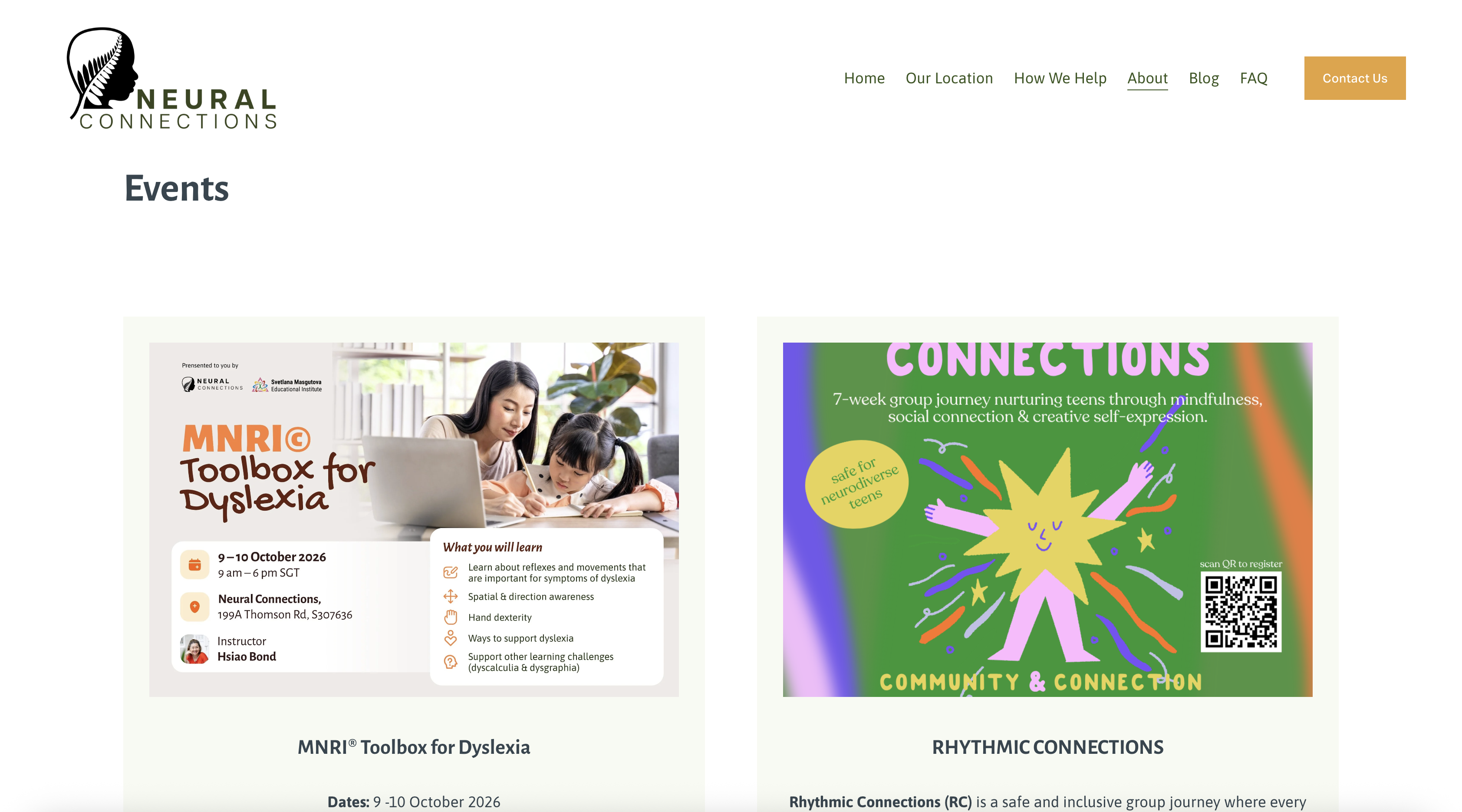
- Workshops
- Training and events for parents and practitioners.
- About
- The practitioners and their credentials.
- Contact
- A low-friction way to reach out and begin.
Warm and Grounded
A warm, grounded palette and soft, humanist type carry the reassurance through every page.
Typeface
Asap
a friendly, rounded sans
The Practice in Full
One calm, coherent experience across the practice.