MUCM
- Role
- UI/UX Designer
- Year
- 2023
- Industry
- Education
- Platform
- Web
- Status
- Live
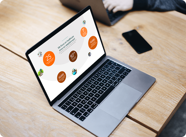
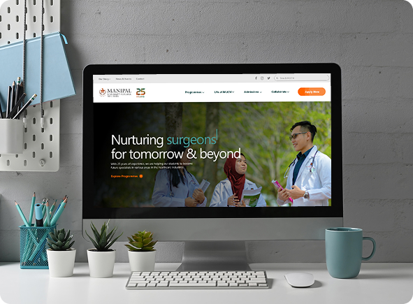
Transforming Medical Education
Manipal University College Malaysia (MUCM) aligns with Malaysia’s vision for educational excellence, pioneering private medical education in the country, and standing among its single largest contributors of doctors to the national healthcare system.
Its mission is exceptional yet affordable medical education. The brief was to make the university’s digital front door live up to that reputation: a website that reads as prestigious, accessible, and built for the people who rely on it.
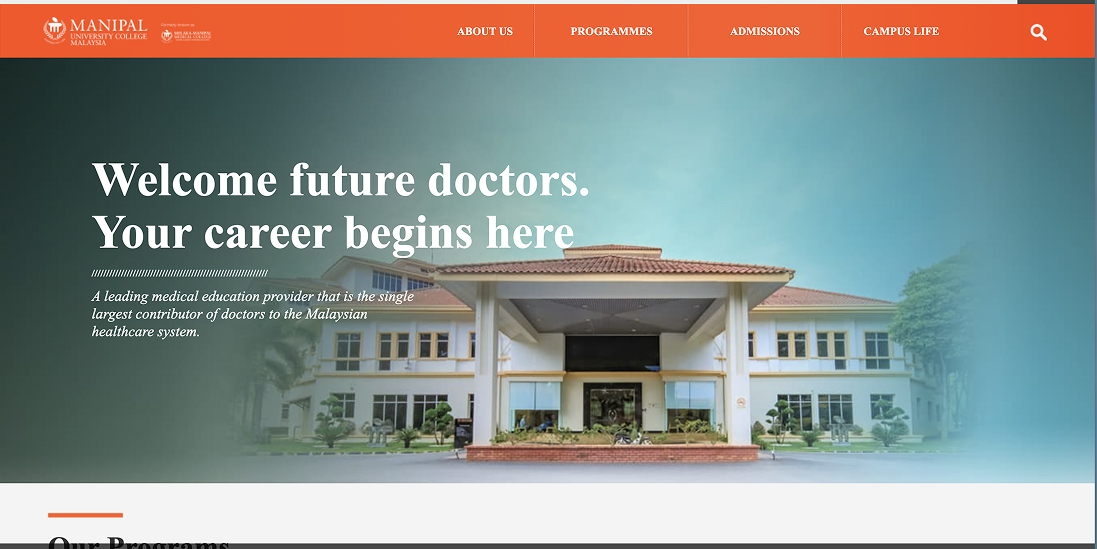
A Barrier, Not a Gateway
The site was the first point of contact for prospective students and researchers, but it had stopped serving them. Students called the experience “overwhelming”: admissions requirements, program overviews, and campus-life details sat buried several clicks deep in dense text pages. For international applicants, the lack of clear navigation and mobile responsiveness made it worse.
Faculty and researchers hit the same wall, publications and departmental contacts were hard to locate, costing collaboration and visibility. Even patients visiting the university hospital struggled to find clinic hours, directions, or how to book an appointment.
The analytics told the same story: high bounce rates on admissions pages, long search times for academic programs, and a steep drop-off on mobile. The website had become a barrier rather than a gateway.
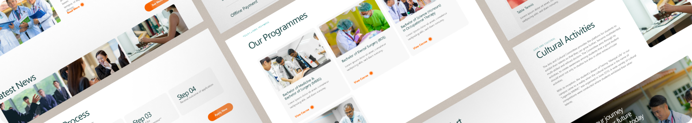
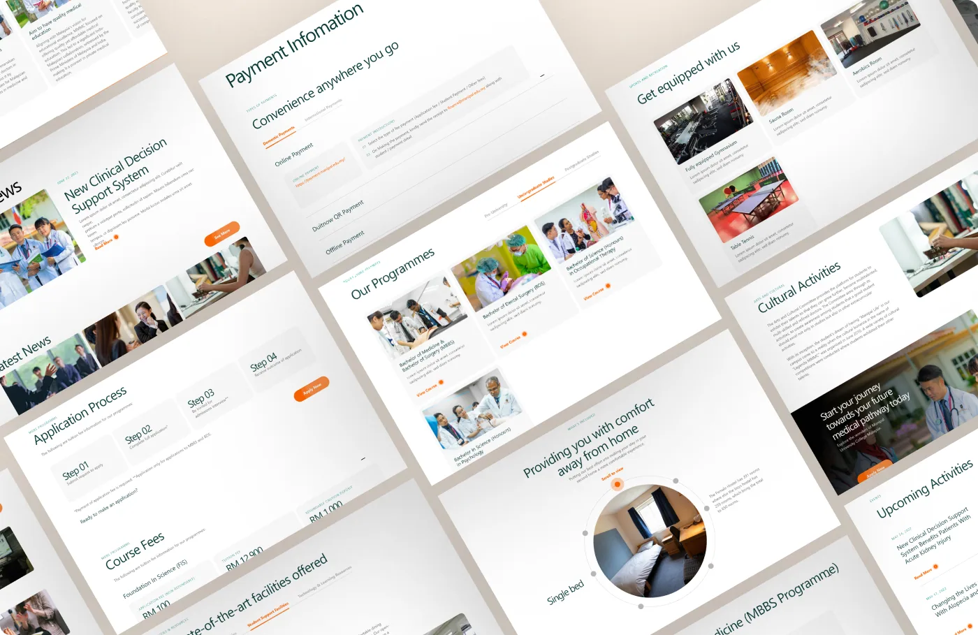
Medical Knowledge for All
The redesign answered real user needs: find information easily and precisely, and surface the university’s courses and media in a concise, well-categorized way. Every fracture in the old site maps to a deliberate fix in the new one.
Admissions information was fragmented across multiple pages.
Redesigned the admissions section into one guided experience.
Research projects and publications were hidden within the site.
A research showcase hub and faculty profile system.
Tuition fees, scholarships, housing and support were buried.
A clear financial and student-support section.
Our Future Collaborators
A persona kept the redesign honest, grounding decisions in a real prospect’s goals and challenges, so pain points could be addressed before they surfaced.
- Name
- Sarah Lim
- Age
- 18
- Role
- High-school graduate
Goals
- Understand admission requirements and deadlines.
- Explore programs, scholarships, and campus life.
- Learn about career outcomes after graduation.
Pain Points
- Overwhelmed by scattered, jargon-heavy information.
- Difficulty finding clear admission steps and timelines.
- Confused by multiple pages for the same information.
Needs
- A step-by-step admissions guide.
- A simple breakdown of programs and prerequisites.
- Student testimonials and campus-life visuals.
Thoughts Against Reality
An empathy map went a layer deeper, mapping what the student says, thinks, does, and feels, so the design could answer the anxieties behind the click.
Says
- “What are the requirements for this program?”
- “Where can I find scholarship information?”
- “I just want a clear checklist of what I need to apply.”
Thinks
- “Am I good enough to get accepted?”
- “What makes this university better than others?”
- “Will I be able to afford tuition and living costs?”
Does
- Visits multiple university websites to compare.
- Scrolls to look for admissions deadlines and fees.
- Asks teachers or friends for guidance on the steps.
Feels
- Frustrated when information is buried or unclear.
- Overwhelmed by long pages of text.
- Excited about medicine, but anxious about the competition.
A Second Home Away From Home
The new colour scheme was built to alleviate stress and recharge the spirit, warm, welcoming, and a little proud. Dark teal grounds the system in calm and clarity of thought; copper brings the happiness and warmth of shining a spotlight on students.
Because the core pain point was the sheer volume of information, the system leans hard on categorisation and a classic serif voice, so a younger audience can find everything readily, presented with the gravity a medical institution deserves.
Typeface
Sabon LT Std (Roman), a classic serif that lends warmth and academic authority to a wall of information.
The Difference in Flow
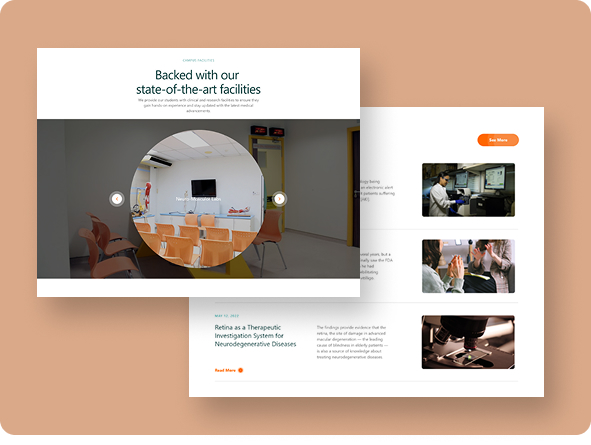
One thing we wanted to fix was giving prospects an insider view of what campus actually feels like. The old site offered little on facilities and campus life, a short blurb where there could have been a world of detail.
So we introduced a virtual tour. It lets prospects explore the campus, take in the surroundings, and gauge the distance between faculties and accommodation, the practical, human detail a paragraph of text can never carry.
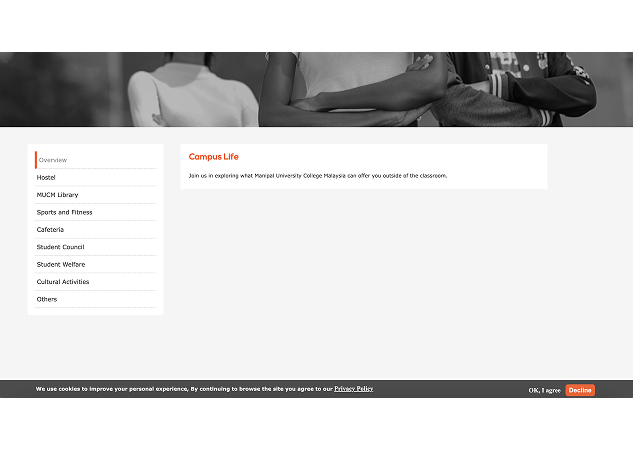
Before: A Short Blurb
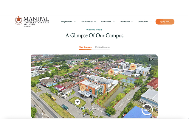
After: A Virtual Tour
Knowledge Made for All
The finished site puts information within reach for students and researchers alike. At this scale, information architecture does the heavy lifting, everything categorized, everything a step closer than it used to be.