INNISFREE
- Role
- Brand Identity (Contributor)
- Year
- 2023
- Industry
- Beauty & Skincare
- Status
- Live
A Brand, Refreshed
innisfree is the Korean beauty house built on natural ingredients from Jeju. As the brand matured, it set out on a revamp: a cleaner, more modern identity that still felt rooted in nature.
My part here was a supporting one, a contribution to the wider revamp focused on the brand identity and, in particular, how the logo looked.
Cleaner, More Modern
Over the years the identity had grown busy, and the mark had become hard to reproduce cleanly across the many places a global beauty brand lives.
The revamp aimed for a simpler, more confident brand: one that reads instantly, works at any size, and keeps the natural, Jeju-rooted feeling at its core.
Before and After
Every change pulled the identity toward clarity and calm.
A detailed, illustrative logo that struggled at small sizes.
A simpler, more legible mark that scales anywhere.
Competing elements diluting the brand.
Restrained, confident and consistent.
An identity beginning to show its age.
Fresh and contemporary, still rooted in Jeju.
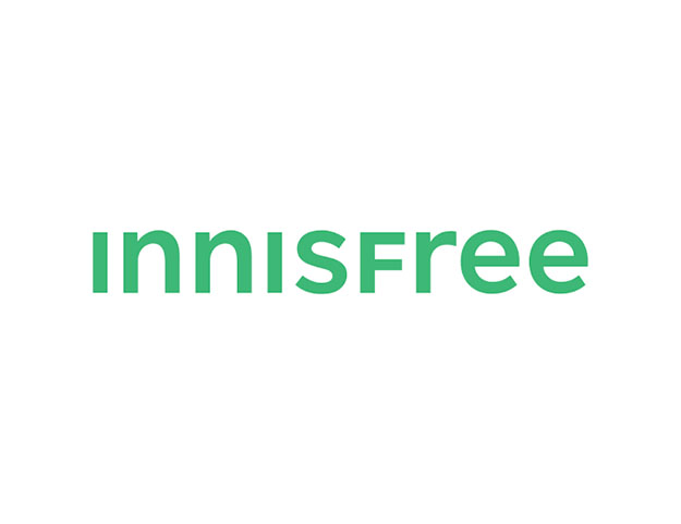
Reshaping the Mark
The focus of my contribution was the logo: simplifying the mark, tightening the wordmark, and making it hold up from a shop sign down to a bottle cap.
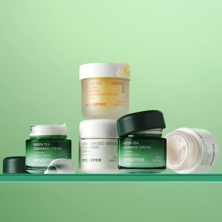
Natural, By Design
Green stays at the heart of the brand, the colour of Jeju and of innisfree itself, paired with clean, open type and generous space.
Typeface
Pretendard
a clean, versatile sans
Out in the World
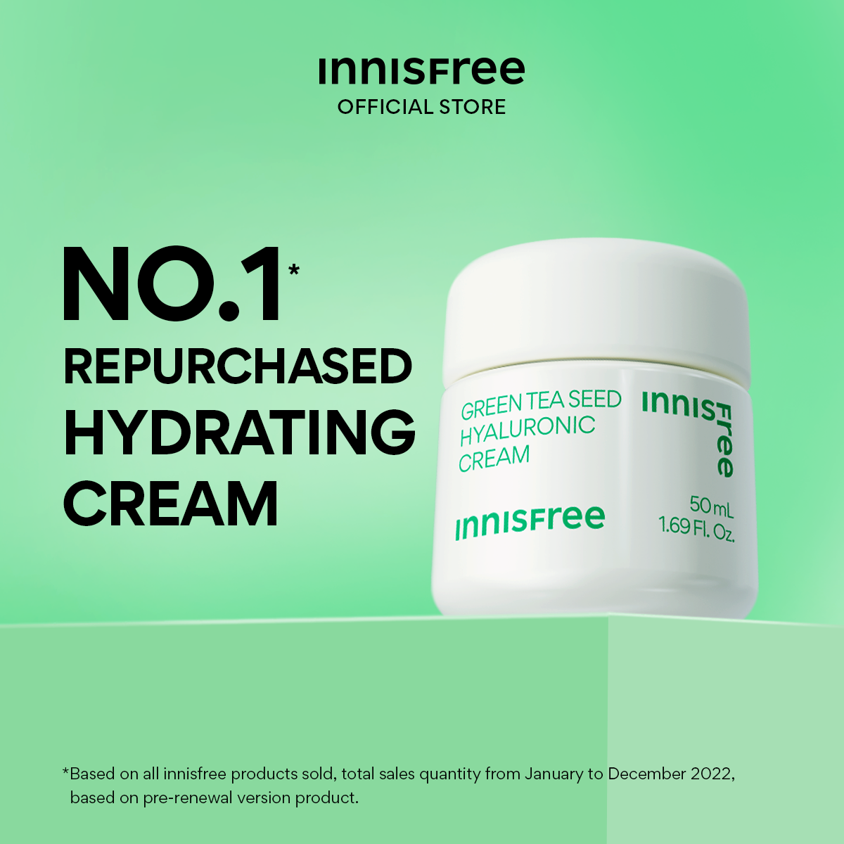
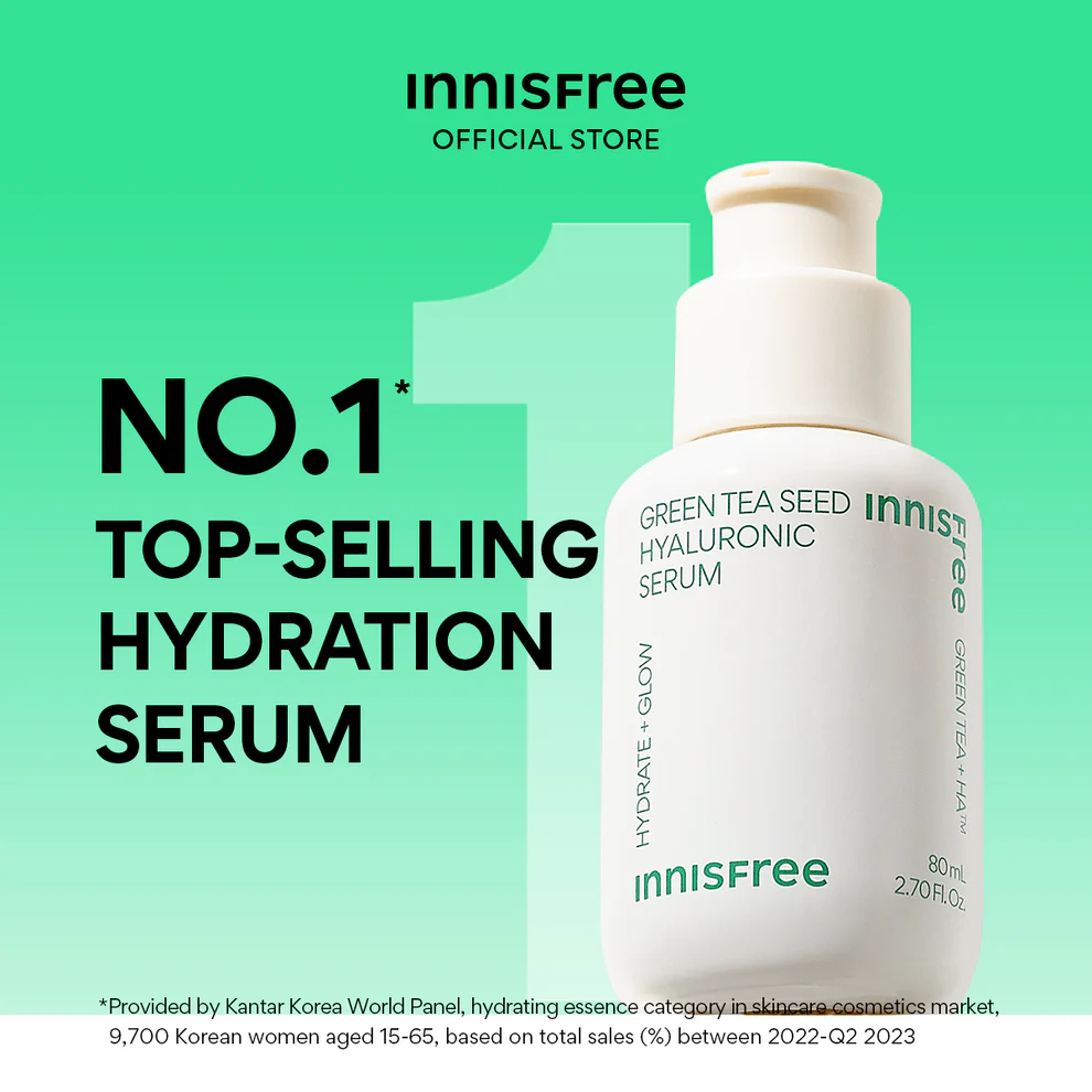
The refreshed identity, applied across the brand.