INTERLUNAR
- Role
- Lead Designer
- Year
- 2024
- Industry
- Tech Consulting
- Platform
- Web App
- Status
- Live
The Operating Model
INTERLUNAR is a technology-consulting firm that runs on a credit-based engagement model: clients purchase credits, and the firm draws them down as it delivers work. That single commercial mechanic creates two parallel obligations to track at all times, what each client still needs, and how much credit each client has left to spend.
Get either side wrong and the relationship breaks: a team over-delivers against an empty balance, or a paying client’s work quietly stalls. The brief was to design the internal CRM that holds both truths in one place, the backbone the firm runs its day on.
A Divide of Data
The firm tracked pending tasks and client needs in one system, and remaining client credits in another. With no platform tying them together, information fragmented across whatever tool was nearest: assets in Google Drive, time logs in Google Sheets, and tasks split between ClickUp and Google Docs.
Day to day, that meant cycling through four disconnected tools to answer one question, and when something was misplaced, simply finding it became the task. The deeper cost: no one, internally or on the client side, could get a single comprehensive view of where a relationship actually stood.
- Google Drive
- Google Sheets
- ClickUp
- Google Docs
Centralization
Fragmentation was the root cause, so consolidation became the thesis: one CRM that centralizes customer data and streamlines workflow, scalable, intuitive, and tailored to each user’s role. Every fracture in the old way of working maps to a deliberate move in the new one.
Relying on multiple disconnected platforms.
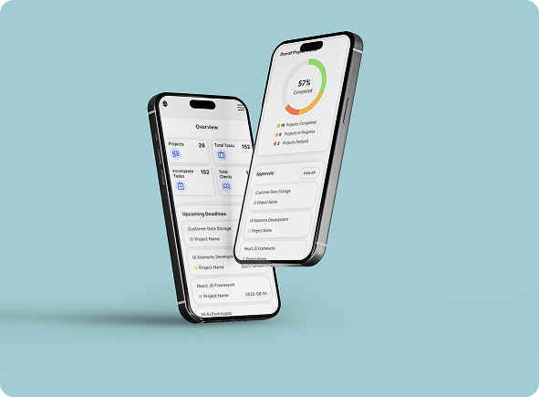
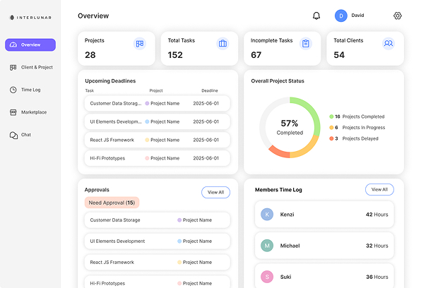
A universal CRM dashboard unifies everything into one source of truth.
Time lost switching tools and reconciling information by hand.
Task flows live inside the CRM, end to end.
Customer-facing data lacking context across fragmented touchpoints.
Key moments from briefs and meetings captured for reference.
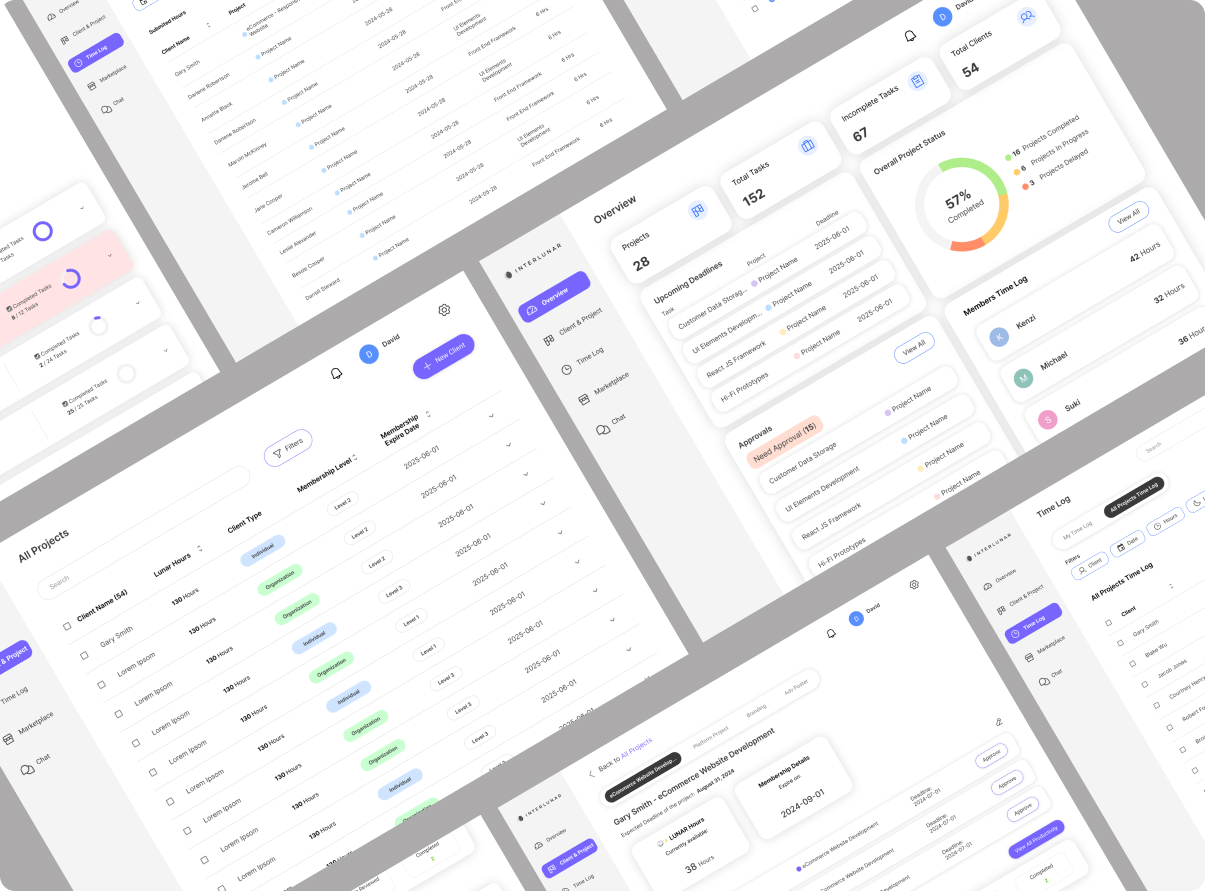
From Admin-First to Project-Centric
The first drafts were purely admin-oriented, built to make internal tracking easy. They surfaced most of the data, but exposed a flaw: different clients needed different information depending on the kind of project onboarded. A rigid dashboard forced every engagement into the same fixed fields, when the work demanded a personalized, per-project view.
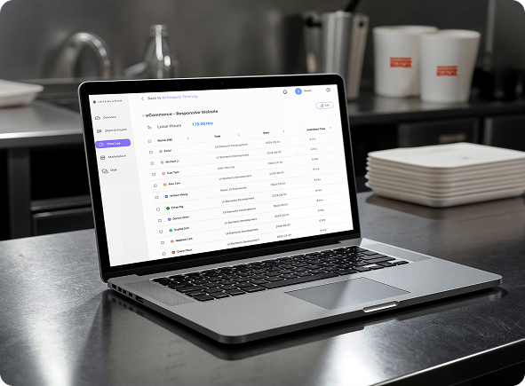
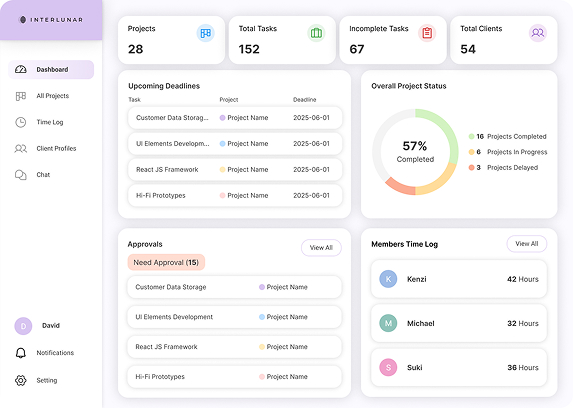
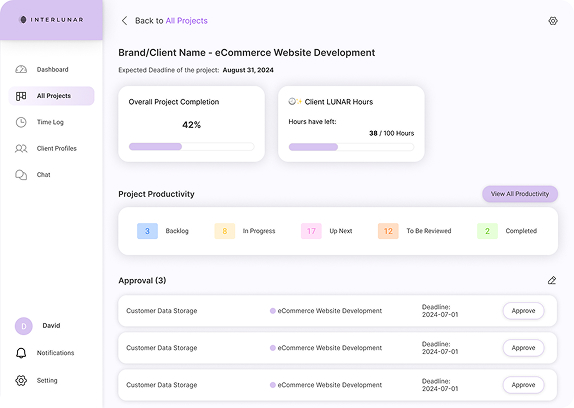
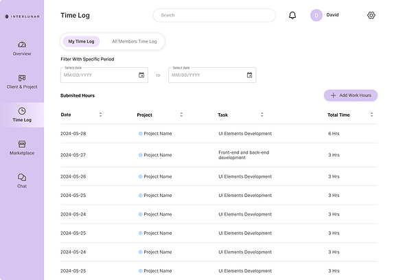
The breakthrough was modelling the real relationship: multiple clients can share one project, and one client can hold multiple projects. Once the data reflected that, a single screen could track many projects at once and read completion alongside hours logged, viewed firm-wide or drilled into one engagement. Time logging was woven into the same fabric: hours accrue per project and per client, surfacing work delivered against the credits that remain.
Three Passes Toward Calm
With the structure settled, the interface was refined against usability testing across three iterations, each one removing noise so attention could land where it mattered.

A softer palette leaning on opacity and colour gradients between cards and tabs, useful for coding warnings and statuses, but the left rail carried too much visual weight.
Decorative colour was cut, icons held constant for recognition, and tabs were made prominent with solid fills. Eye strain dropped, yet attention still scattered across competing sections.

A muted base reserves accent colour for the few things that truly need it. Left-nav items collapse to single lines with accent active-states, and every card sits where an admin expects it.
Neutral Base
Colour as Signal
Primary#6C5CE7
Active navigation and primary actions
Complete#2FBF71
Approved, completed, on track
In Progress#F5A623
Ongoing work and pending states
Delayed#F26D6D
Overdue, needs attention
Typeface
Inter
a precise, screen-native sans
Design Foundations
The principles the system holds to as it scales, the rules that keep a new module feeling familiar the moment it mounts.
- Data Model
- Many-to-many, one client can hold multiple projects; one project can span multiple clients.
- Role Tailoring
- Per-role dashboards composed from one schema, admin, team, and client-facing views.
- Time & Credit
- Hours logged per project and per client, read against each client's remaining credit balance.
- Colour as Signal
- A neutral base holds saturated accents in reserve for warnings, status, and approvals only.
- Navigation
- Single-line left rail with accent-coded active states; iconography kept constant for recall.
- Density
- High-density rows with fixed card placement, so operators build spatial memory of the interface.
The Finished Suite
The system in full, one coherent environment across every surface the team works on.