AVM CLOUD
- Role
- Lead Designer
- Year
- 2023
- Industry
- Cloud Computing
- Platform
- Web
- Status
- Live
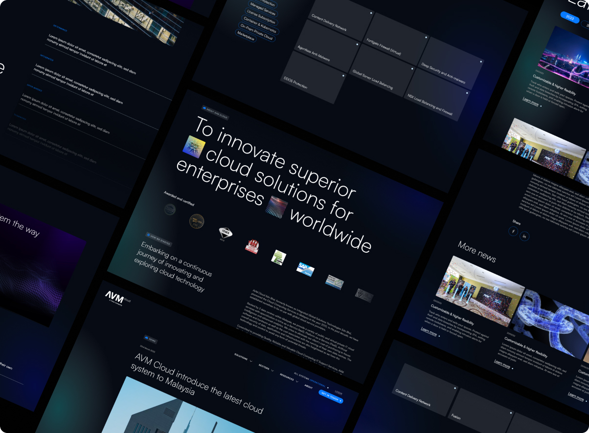
New Systems, New Interfaces
AVM Cloud pioneered cloud-computing services in Malaysia back in 2010 and grew to stand on par with global providers. To match that standing, they needed a brand refresh, a way to show the world they were firmly in step with the new.
The mandate was bigger than a fresh coat of paint. The site had to rebuild trust, guide visitors effortlessly to the right content, and ultimately drive measurable business results.

A Cluttered Room
The existing website felt like stepping into a cluttered room. The content was there, but buried under confusing navigation, inconsistent layouts, and dated visuals, visitors struggled to find even a basic product or service detail.
Analytics confirmed the feeling: high bounce rates on key landing pages, weak engagement on calls-to-action, and poor mobile performance. The site had simply not evolved alongside the business.
For the client, that meant paying for marketing campaigns that drove traffic to a site which didn’t convert, potential customers were leaving before ever reaching the value on offer.

The Digital Age
The redesign set out to solve real user needs: help visitors find information easily and precisely, and surface the products they didn’t yet know they needed. Every friction point in the old site maps to a deliberate fix in the new one.
Critical information was hard to find, spread thin across many pages.
Content pulled into one well-structured information architecture.
Visitors bounced off overly technical jargon.
Hierarchy reframed around clear, outcome-led value propositions.
The pricing structure was difficult to understand.
Proper tier comparisons and transparent breakdowns.
Targeting the Needs
A persona kept the redesign honest, grounding decisions in a real user’s goals and challenges so pain points could be addressed before they surfaced.

- Name
- Alex Tan
- Age
- 42
- Role
- CTO, mid-sized enterprise
Goals
- Find a reliable, scalable cloud provider for company-wide adoption.
- Compare pricing, security, and compliance features quickly.
- Get a clear value proposition, without the technical jargon.
Pain Points
- Overwhelmed by feature-heavy sites with unclear messaging.
- Hard to compare providers side by side.
- Wants transparency in pricing and performance guarantees.
Needs
- A high-level overview of solutions, ROI, and security certifications.
- Clear case studies and enterprise success stories.
- An easy way to contact sales or request a demo.
In Their Shoes
An empathy map went a layer deeper, mapping what the user says, thinks, does, and feels, so the design could answer the anxieties behind the click.
Says
- “I need to know if this solution is secure and reliable.”
- “How does this compare to other providers?”
- “Show me the ROI before I commit resources.”
Thinks
- “I need transparency in pricing and performance.”
- “What risks are we taking by switching providers?”
- “Am I making the right choice?”
Does
- Requests demos or case studies from vendors.
- Delegates technical deep-dives to engineers.
- Discusses options to validate budget impact.
Feels
- Overwhelmed by the complexity of technical information.
- Cautious about committing to long-term contracts.
- Pressured to choose quickly under business timelines.
Perspectives
Blue anchored the system, a colour long associated with trust, stability, and reliability, and one that reads as forward-thinking and cutting-edge. Exactly the perception a cloud pioneer wants to project.
As lead designer I prioritised readability and clear categorisation while bringing a fresh, advanced look. With an older target audience, typography carried real weight, so type was treated as a first-class asset, not an afterthought.
Typeface
Satoshi, a bold, geometric sans tuned for readability at every size.
Total Refresh
The finished site leans futuristic, a nod to the cloud in its name. The blue system carries through, joined by abstract elements that draw the connection between technology and the new age.